ScoreBig App
Are you feeling lucky?
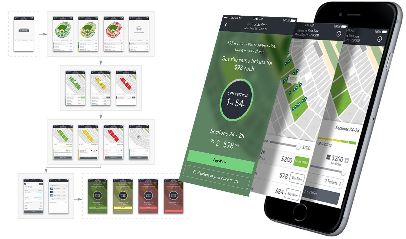
My team and I expanded on the original concept and filled in many gaps, which was initially contracted to a 3rd party. The iPhone app was a huge departure from the way users were used to interacting with ScoreBig. Because touch is the primary interaction, much of the pathing was revisited.
Both Make Offer and Everyday Savings tickets were blended together into one list to surface any hidden inventory.
A new slider adjusts pricing and makes bids on select tickets simpler.
A revamped meter highlights your chance of success.
The timer on a counter-offer is more prominent to give a better sense of urgency on the deal.
I especially enjoyed creating the interface for the counter-offer flow you see here.
